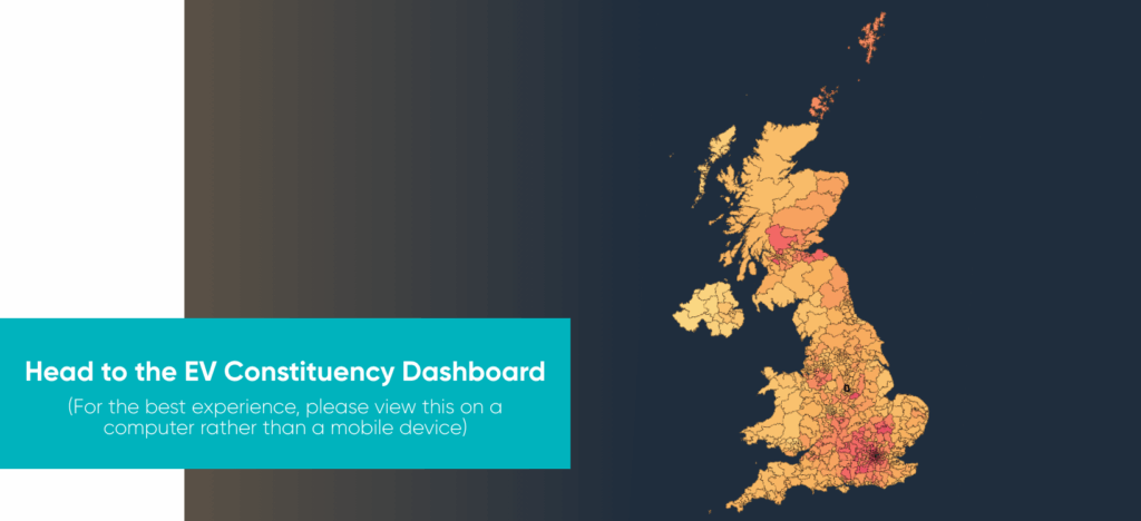
The Dashboard

Two years ago, we launched our first EVA England Constituency Map. It provided a detailed snapshot in time of how local areas across England were progressing in their journey towards supporting electric driving.

Since then, the EV sector has evolved at pace. Electric cars now make up nearly a quarter of all new car sales; there are over 86,000 public chargepoints in place and rising; and public confidence in EVs is improving, with results from our own driver’s surveys suggesting that 95% of EV drivers would recommend them to their family and friends, and two thirds of petrol and diesel drivers considering an EV for their next car.

The barriers to uptake of electric driving are also shifting. Upfront cost is still a significant concern for many households. However, it is the charging divide between those who have a driveway and can access private, cheaper charging and those who do not that is becoming the greatest single barrier to greater uptake of these cars.

Roll out of public charging infrastructure that is affordable and accessible to those who cannot access private charging is becoming absolutely central to the success of the EV transition.

That is why we felt that now was the time to update our Constituency Map: to give all those who are engaging in the roll out of residential public chargepoints – be it local authorities, drivers, national policy makers, or industry – an up to date picture of how each area across England is doing in its journey towards supporting its residents in accessing and using EVs.

The Map has been developed for us by Field Dynamics, with input from Zapmap. It takes you through the proportion of EVs being used by households in each area, and how well these households are served by public chargepoints of differing charging speeds or power. It is a snapshot in time of how each area is doing compared to its neighbouring constituencies, and within its region.

It is a tool that we hope will shed light on those areas of the country that are keeping pace with consumer demand for EVs, and those where there is work still to do. That work will take continued collaboration across industry, and local and national policy makers and delivery authorities; and it must also continue to include the voice and lived experience of the most important people in this transition, the EV drivers themselves.

Head to the EV Constituency Dashboard now to see how your area is doing

(For the best experience, please open on a computer rather than a mobile device)

Local areas to watch

The map shows a clear divide between areas that are successfully expanding public charging access and encouraging EV uptake, and those that are falling behind.

London boroughs dominate the list of places performing best. It is estimated that across London nearly 60% of households lack off-street parking, yet significant progress in rolling out residential chargepoints across these areas means they have much higher levels of EV uptake (defined as the proportion of vehicles in the constituency being electric) than other parts of the country. Within the top five of these boroughs, over 99% of households are within reach of a chargepoint, and in Queens Park and Maida Vale, and Kensington and Bayswater, over 10% of cars within the borough are electric.

Outside of London, areas such as Coventry and Brighton have also seen substantial recent increases in residential chargepoint infrastructure, with just under 90% of households in Coventry South and Brighton Pavilion within five minutes of a charger. We can therefore expect to see levels of EV uptake in those areas rise as drivers respond to the ability to access convenient charging.

In contrast, several constituencies in the Midlands, the South West, and parts of the North show low levels of EV uptake, signalling that drivers in these areas are not yet finding EVs workable or attractive enough.

Across Plymouth, Kingston upon Hull, and West Midlands constituencies, including Smethwick, West Bromwich and Tipton and Wednesbury, less than 2% of cars are electric vehicles. Our EVA England driver survey results suggest that, in these areas, concerns around a lack of charging infrastructure, general confidence in what is a new technology, and affordability barriers remain.

Our EVA England driver survey results suggest that, in these areas, concerns around a lack of charging infrastructure, general confidence in what is a new technology, and affordability barriers remain.

Overall, the map highlights encouraging pockets of real progress in supporting drivers to make the switch to electric vehicles; however, it also reveals clear gaps where targeted action is needed to ensure that the transition to electric driving is equitable across the country.

How the Dashboard was put together

The EVA Constituency Map combines several national datasets to give an accessible picture of electric vehicle (EV) progress in every Parliamentary constituency (a geographically defined area that is delimited based on population size, with each constituency aiming to have a relatively equal number of residents).

EV adoption figures from the Department for Transport were first calculated at local authority level, then apportioned into constituency boundaries using household counts to reflect how populations are actually distributed. This ensures the results are meaningful locally rather than relying on broad administrative areas.

To assess charging access, the map integrates Zapmap’s national charger data with Field Dynamics’ household-level dataset, EV Map, which identifies homes without off-street parking. By modelling five-minute walking catchments around every public charger, the tool highlights how many residents can realistically access charging, capturing coverage even where catchments cross constituency lines.

Energy demand projections from Field Dynamics’ GigaMap are then added, and all metrics are ranked nationally and regionally to give a clear sense of how each area compares.

Read the full methodology here

Share via
Copy link
Powered by Social Snap